The Toolbar
| ||||||||||||||||||||||||||||||||||||||||||||||||||||||||||||||||||||||||||||||||||||||||||||||||||||||||||||||||||||||||||||||||||||||||||||||||||||||||||||||||||||||||||||||||||||||||
 Home button loads the default diagram.
 Open a network diagram file.
 Save the current document.
 Print the current document.
 Online Library button opens a web browser window and navigates to
the
Online Library button opens a web browser window and navigates to
the
 Paste Button switches to paste mode for a single paste operation.
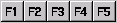
 Paste Multiple Button switches to paste mode and remains in paste mode for
multiple paste operations.
Paste Multiple Button switches to paste mode and remains in paste mode for
multiple paste operations. Exit Button.
 Reload document button (optional button see
 Close current document.
 on the toolbar to remove selected items.
Layers (Drawing Order)You can control the drawing order for objects, text and links by setting the layer. Layer 5 is drawn first through to layer 0 which is topmost. Set the layer using one of these methods:
|
|
|
Background ObjectsSetting an object to be a background object in the Object Properties form enables you to draw multi-segment links over the top of an object without connecting to it. |
||
Unlinking Objects
To remove links between objects, right-click the link
and choose delete or select the objects which are linked and then click
the Unlink Button  .
.
Using the Link Break Feature
The Link Break Feature enables you to break a link and
create a join anywhere on an existing link. When you right-click the
link and select Break a new "link-node" is highlighted which you
can then drag and drop or nudge to the desired position.
To remove a
join select the link-node which forms the join and delete it.
Moving and Copying Objects
To move selected objects, hold down the Shift Key
and drag the object to it's new position.
To copy objects, select them and then click then Copy Button .
Click the Paste Button
.
Click the Paste Button  to enter Paste Mode and the position the cross hair and left click to
paste copies of the objects. To finish pasting, click the Paste Button
again, or double right click the background to exit the current mode, or
hit the escape key.
to enter Paste Mode and the position the cross hair and left click to
paste copies of the objects. To finish pasting, click the Paste Button
again, or double right click the background to exit the current mode, or
hit the escape key.
Nudging Objects
To nudge selected objects, hold down the Shift key while pressing one of the cursor keys.
Changing The Name (Or IP Address) Of An Object
To change the name of an object or change it's
IP address, Double Left Click on current name or IP address and type in
the new details. Press Enter to complete.
You may also change these details by right clicking the object and selecting
"Properties".
To insert a Carriage Return in an Object or IP Label
use
Shift + Enter.
Adding Text To A Diagram
|
Click the Text Mode Button Tip: Double right click the background to toggle the last used mode (Paste, Text, or Link) off and on.
|
|
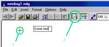
Editing Text
Double click text to start editing it. The Text Mode
button will indicate you are in text mode. Press ESC to finish editing the text, or click the text mode
button on the toolbar.
To delete a Text Box, double click it and then hit backspace. Press
ESC or click the text mode button to exit text mode.
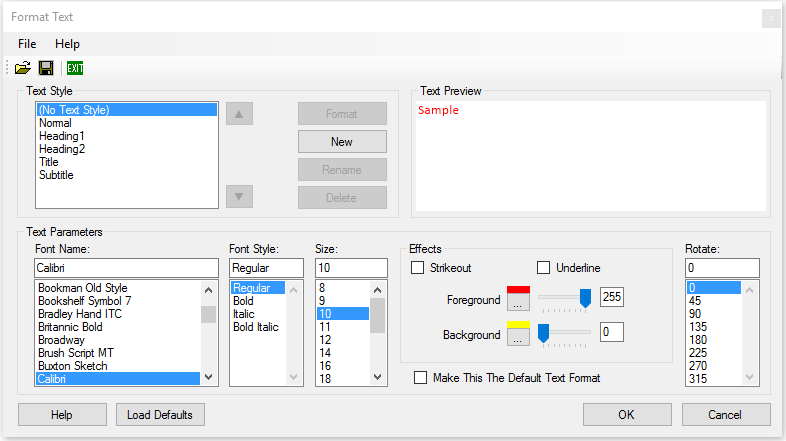
Formatting Text
 |
|
|
Moving TextTo move text, hold the SHIFT key down and drag the
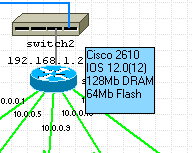
text. Adding Float Text To ObjectsInformation can be displayed when the pointer is held over an
object for a few seconds.
|
|
Adding Horizontal And Vertical Backbones
|
Add horizontal and vertical backbones to your diagram by selecting them from
the Backbones object library. |
|
Resizing And Moving Backbones
To resize a backbone, position the mouse pointer over either
end then hold the left mouse button down to drag the backbone larger or
smaller.
To move a backbone, hold the shift key down whilst dragging the backbone to
a new position.
Customizing Backbone StylesBackbones are Shapes and they can be customised by right clicking and select Format Shape. |
|
Linking An Object To A Backbone
To link an object to a backbone, click on the link
mode button  and then join the backbone to the object.
Grouping and Locking
Objects may be grouped together and then locked in position relative to each other to form composite objects.
The first object you select will become the "parent" object and further
objects selected will be "child" objects.
Select the parent object, followed by the child objects and then select
Format > Group from the ring menu to group the objects together. At this
point, you may still move the objects relative to each other. Copying and
pasting the parent object will copy and paste all of the child objects as
well.
To lock the child objects position relative to the parent object, right
click the child object and select "Lock" from the menu. Now when you move
the child object, the parent and all of its child objects are moved
together. If you resize the parent object all locked child objects are
also proportionally resized and moved.
Right-clicking a parent object and selecting Lock > Group Lock or Group
Unlock locks or unlocks all child objects and labels associated with the
object.
To ungroup objects, select each of the members of the group and
then click Format > Ungroup on the ring menu.
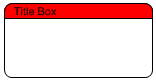
Example using the two shapes created in the Custom Shapes section to form a composite Title Box object:
|
|
Position the two shapes to form a title box. Select the parent box and then the title bar box (CTRL-left click), then Format and Group from the ring menu. Right click the title bar box and select "Lock" to lock it's position relative to the main box. |
Locking objects which are not a member of a group is used to lock the position of the object on the page. This is useful for things like template borders and title blocks which don't normally need to be moved. Objects locked to the page have the following properties:
- They cannot be moved with drag and drop.
- They cannot be selected with CTRL-A or by dragging a band around them.
Anchoring and Locking
Anchoring fixes the position of objects and text relative to one of
the four corners of the page. This is useful when resizing the
page to ensure a title block and border remain fixed to the edge.
Select objects and text to be anchored and then Format > Anchor from the
menu.
Locking objects and text prevents them from being dragged to a
new position (relative to their parent) and also prevents them from
being selected and unselected using CTRL-A. It is useful if the title
block and border are locked. You can then select your diagram using
CTRL-A and reposition it using drag and drop or nudge, without adjusting
the position of the title block and border.
Select objects (link
nodes) and text to be locked and then Format > Lock or right click
objects or text and select Lock.

Hiding IP Addresses
To Reveal or Hide IP addresses, toggle the IP Address
Button  .
.
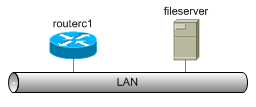
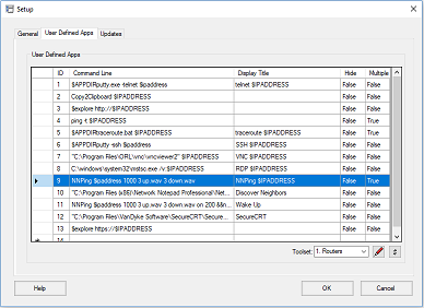
User-Defined Apps
A list of user-defined Apps is presented for execution
when you right click an object. The first 6 of the Apps are also
available using the function buttons on the main toolbar:
 .
Variables such as IP address or hostname of the object can be included
in the App definition.
.
Variables such as IP address or hostname of the object can be included
in the App definition.
A set of user-defined Apps is called a
toolset. Up to 10 different toolsets can be configured for use with
different types of equipment and then assigned to the objects in your
diagram.
Tip: Network Notepad Files are stored as plain text. Use Windows "Search for Files" to scan through all your diagrams and find what you are looking for.
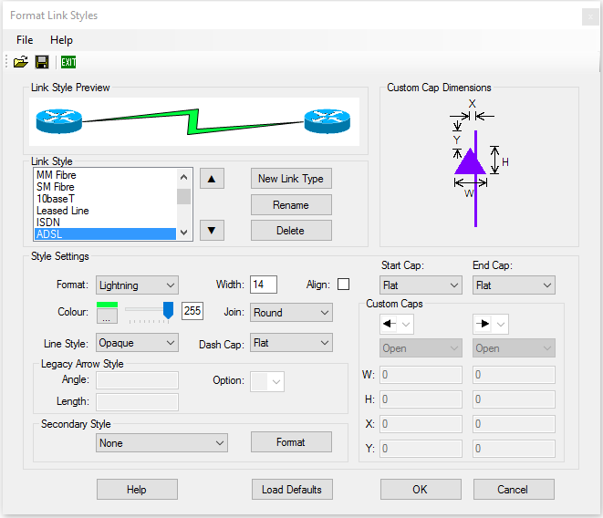
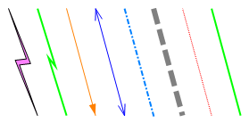
Customizing Link Styles
Select Format > Link Styles on the ring menu or right-click a link and select Format Link style.
|
|
|
|
Style Settings
Format: Choose between Line, Lightning, Lightning2, Legacy Arrows,
Curve and Curve2 Styles. For the Lightning style to be effective set the width to 14 or more.
Legacy Arrow Style: It is recommended to use custom end
caps for drawing arrows rather than legacy arrow style. Legacy arrow style
has one nice feature though; If the link connection point is centred the
arrow head is automatically drawn where it crosses the boundary of the
object as shown in the example below.
The Legacy Arrow style is selected by choosing "------->","<-------" or "<------->" in the Format dropdown list. 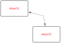
Secondary Style: Enables the link to be drawn using
more than one link style. Click the Format button to work on the secondary
style. |
|
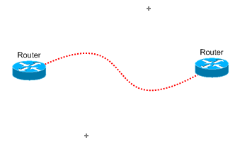
Curve Link StyleCurved link styles use one or two link nodes to act as control points for
the curve. From the ring menu select "Options" and "Show Link nodes" to
display link nodes while you are drawing curves. |
 |
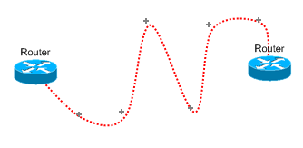
Curve2 Link StyleCurve2 Link Style allows you to draw curved Links with any number of
control points.
|
|
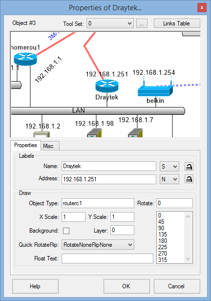
| THE OBJECT PROPERTIES FORM |
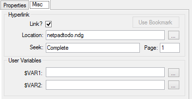
Drag And Drop Method For Linking Diagrams
Another way to create a link to a diagram is to drag and drop the .ndg file you want to link to on to the canvas of the current diagram. This adds an object which provides the link as discussed above.
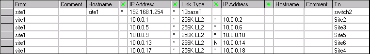
The Links Table
|
The links table shows a table of all the connections to an object.
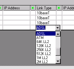
Changing Link StylesTo change a link's style in a diagram right click the link and choose "Set
link style". You may also change a link style from the Links table by clicking a
cell in the Link Type column and choose the new link style from the drop down
list. |
|
 columns are drop-down boxes from which you choose the display position
relative the object for the IP Address or Hostname.
columns are drop-down boxes from which you choose the display position
relative the object for the IP Address or Hostname.
Object Properties Toolbar
The Object Properties Toolbar is optional. It provides quick access
to some of the properties for the most recently clicked object.
Enable the toolbar by selecting Options > Object Properties Toolbar
from the main ring menu.
The controls displayed on the toolbar
are covered in the Object Properties Form section above.
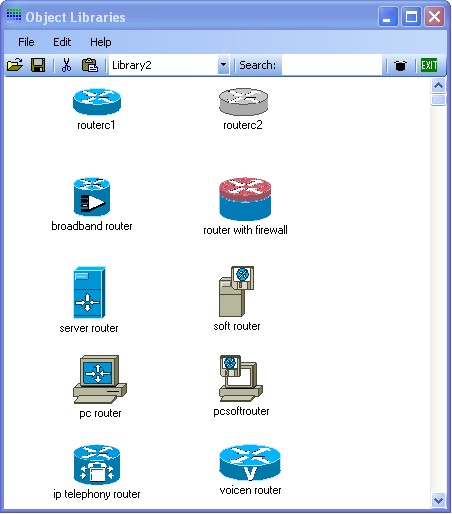
| THE OBJECT LIBRARY FORM | |
|
Searching Object LibrariesThe search box on the toolbar may be used to search all available libraries
for objects. Adding Objects To An Object LibraryDrag a .ico, .bmp, .wmf, .gif, .png or .jpg file
on to a blank part of the Object library form. Right clicking an object allows you to change an
objects default name, filename and X/Y scale. Deleting Objects From The Object Library FormTo delete an object from the current Object Library, select the object followed by "Edit" and "Cut Image from Object Library". Auto-Hiding The Object Library FormTo auto-hide the Object Library Form whenever an object is selected click File > Auto-hide. |
 |
Creating New Object Library Files
On the ring menu select File>New to create a new, blank Object Library file. Paste new object images as explained previously and then use File > Save As to save the new Object Library.
Sharing Object Library Files
A workgroup Object Library (Folder) may be specified in the main
setup form. Network Notepad will use this library when the shared drive
is available. Otherwise it will use the default local copy.
To set this up initially, copy contents of the local objects folder to the
shared folder.
| CREATING CUSTOM SHAPES |
Shapes are simple graphics which can be customised. There are some
shapes preconfigured in the "Shapes" and "Backbones" Object Libraries.
Select Format > Shape from the main ring menu or right click a shape in
a diagram or the Shapes Object Library.
Format ShapeTemplate Shape: Is the name
of an existing shape which you can then customize.
|
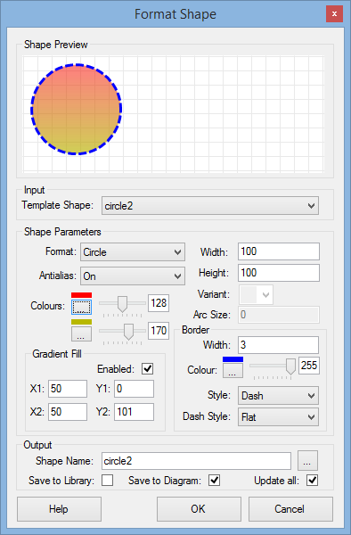 |
Example Shapes
 |
Rectangle, Width=200, Height=100,
background set to transparent by setting the colour slider control to
the left. Arc size 20 sets radiused corners. |
 |
Rectangle, Width=200, Height=100, Variant is set so that only the top two corners are radiused. |
See Grouping and Locking for information on combining these shapes in to a composite object.
| SCRIPT OBJECTS |
"Script Objects" provide a way to construct vector-based
graphics
for use in Network Notepad from plain-text scripts. Some examples
are available in the
scripts library.
Script Syntax
A Script Object consists of the following statements:
1. The script statement sets the name, the overall size of the object, and the revision number.
| script "Test object" 50 20 0.1 | script name width height
revision |
|
| name - name of the script object. If the name contains
spaces then enclose it in "quotation marks". The name should
be globally unique. |
||
| width - width of the object. |
||
| height - height of object.The width and height set the
size of the outline box displayed when pasting the object. In the examples I am using a default scale of 1pixel per mm. |
||
| revision - Revision number of the script. When pasting
scripts which already exist in the diagram, the script will
only be replaced if the new script is a higher revision. |
2. Align statements optionally enable objects to be automatically aligned when one object is pasted or dragged and dropped on to another object.
| align + screw -11 6 454 6 -11 50.5 | align +
(or -) type points |
|
| + or -. A "+" script can only align
with a "-" script. |
||
| type - For scripts to align the type must
match between the two scripts. |
||
| points - A list of X Y alignment points. |
3. Path statements define the shapes, lines and text in the object.
| path name test | path name
name name - name of graphics path. |
|
| path startfigure | path startfigure Starts a new path rather than continuing the previous path reference. |
|
| path addline 10 10 10 20 | path addline
x1 y1 x2 y2 Adds a line to the current path. |
|
| path addlines 10 10 10 20 30 15 | path addlines
x1 y1 x2 y2... xn yn Adds a series of lines to the current path. |
|
| path addrectangle 10 20 30 40 | path addrectangle
x1 y1 width height Adds a rectangle at the position specified with the width and height specified. |
|
| path addarc 41 4 5 5 270 90 | path addarc
x y width height start-angle sweep-angle Adds an arc to the current path. x y width height - define a rectangle which forms the bounds of the arc. start-angle - measured in degrees clockwise from the x-axis. sweep-angle - angle swept from start angle. |
|
| path addstring 39 2
"McGoozon" arial 3 1 |
path addstring
x y "text" font-name font-size font-style x y - specify the top left corner position of the text. "text" - text string to draw. font-name - Name of font. Enclose in quotation marks if the font name contains spaces. font size font style - Numeric value, Regular=0, Bold=1, Italic=2, Bold Italic=3, Underline=4, Strikeout=8 Use a fill command rather than a draw command to render text. If you use a draw command the outline of the text is drawn. |
|
| path closefigure | path closefigure
- Draws a line from the
current position to the start point in the current path. |
4. Pen and Brush statements define the pens and brushes used in the commands section below.
| pen black_pen0.5 &h000000& 255 0.5 | pen name colour transparency
width Pens are used with draw commands to draw the outline of a a path. name - name of the pen. colour - Blue green and Red values in Hex. transparency - Number from 0-255 where 255 is solid colour. width - width of line drawn with the pen. |
|
| brush grey_brush &ha0a0a0& 255 | brush name colour
transparency Brushes are used with fill commands to fill an area enclosed by a path. name - name of the brush. colour - Blue Green and Red values in Hex. transparency - Number from 0-255 where 255 is solid colour. |
5. Commands are used to draw paths using pens and fill paths using brushes. The options command enables optional drawing commands to be executed at runtime by right clicking an object and selecting "Options".
| fill test grey_brush 20 10 | fill path brush x y [xscale yscale]
[angle] Fill an area enclosed by a path using the specified brush. Draw at position <x> <y> and apply an optional local scale transform and/or rotate transform. path - name of path to fill. brush - name of brush to use. x y - position of drawing. xscale yscale - scale transform. Negative values are used to flip the drawing about the x or y-axis. For an example of this see the left and right brackets in the 2960 switch which use the same path but flipped about the y-axis. angle - optional rotation angle in degrees (introduced in version 1.3.11). |
|
| draw "top box" black_pen0.5 20 10 | draw path pen x y [xscale yscale]
[angle] Draw the outline of a path using the specified pen. Draw at position <x> <y> and apply an optional local scale transform and/or rotate transform. path - name of path to draw. pen - name of pen to use. x y - position of drawing. xscale yscale - scale transform. Negative values are used to flip the drawing about the x or y-axis. angle - optional rotation angle in degrees (introduced in version 1.3.11). |
|
| option "brackets" | option name The option command is followed by optional fill and draw statements which can be enabled or disabled at run-time by right-clicking the object and choosing "Options". E.g. See the brackets and screws options in the 2960 switch example. name - provides the text which will be displayed in the options menu. |
Format Script Object
Format Script Object provides an environment
for creating and modifying Script Objects. Access it from the Format
menu or right-click a Script Object in a diagram or the library
window.
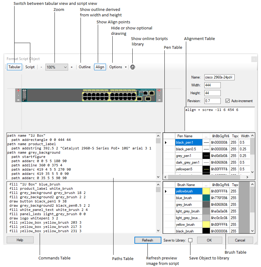
To paste a script in to the editor, switch to script view
(Script button) and paste in to the main panel.
Colour
Pickers for pens and brushes are available in the Tabular view
by clicking the elipsis column (...) in the
respective tables.
&hBbGgRr& specifies the Blue, Green and Red
components of the colour in Hex.
Tspcy is the colour
transparency value from 0 to 255, where 255 is solid colour.
The form is resizable and the panels can also be resized by dragging
the horizontal and vertical bars which divide the panels.
Click the Refresh button to apply changes made in the script panels.
| THE SETUP FORM |
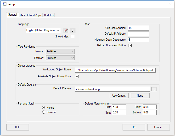 |
The Setup Form
To access the Setup Form select File > Setup from the main ring menu.
General Settings Tab
Language: Select the Language used for Network Notepad.
 :
This button opens the selected language translation file for editing.
:
This button opens the selected language translation file for editing.
 :
This button refreshes translations from the language translation file.
:
This button refreshes translations from the language translation file.
Show index: To assist with language translations this
temporarily prepends entries with section number and line number to show where
each text entry is located in the language translation file.
Grid Line Spacing: Sets
the spacing for grid lines when grid lines option is switched on
("Options","Grid Lines").
Default IP Address:
A partial or complete IP Address which will be applied to all new objects
added to the diagram.
Maximum Open Documents: Sets how many documents can be
opened at once. Each open document presents its own tab bar at the bottom of the
screen.
Reload Document Button: Enables a Reload
Document button on the toolbar. This is useful if you edit the diagram outside
of Network Notepad and need to quickly reload the current file.
Default
Diagram: Sets the diagram loaded by default if no diagram is specified
on the command line. Use the ellipses button to browse for a file or the
"Use Current" button to make the current diagram the default diagram. The "None"
button clears the default diagram.
User-Defined Apps Tab
For information on the User-Defined Apps, see User
Defined Apps.Updates Tab
Enable Automatic Updates: Tick to enable
automatic updates (default).
Update Type: Select from Automatic, Check and Download, and Check
only.
Manual Proxy Settings: Tick to enable automatic updates with manual
proxy server settings.
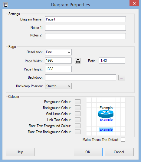
| The Diagram Properties Form |
|
 |
| TEMPLATES |
Templates
When you start a new drawing or add a new page to an existing document,
you are prompted to select from a list of templates. A diagram template is
simply a minimal diagram which contains defaults for the new drawing. It
sets the page width and height and orientation, default font, link link
styles and it can contain some default drawing, for example a title block
and border.
Creating Diagram Templates
To create new diagram template, set up a new single page document with
the desired settings and default drawing as mentioned above and then save it
to the templates folder using File > Save to Templates.
| MISCELLANEOUS |
Adding A Backdrop Image
Drag and drop a bitmap file (.bmp, .png, .gif or .jpg) on to the page
to use as a backdrop image for your diagram.
In the Diagram Properties form, you may also specify a filename for a
backdrop bitmap, and you can select whether to stretch, centre or tile
the image.
Export To Bitmap Graphics File
To export a diagram as a bitmap file, from the ring menu, select File and then Export To Bitmap Graphics File. Enter a suitable filename when prompted. The following bitmap file types can be selected from drop-down list: .bmp, .gif and .png.
Setting A Default Diagram
You may configure a default diagram to be displayed when Network Notepad is
run. The default diagram is configured in the Setup Form.
Working with CSV files
Network Notepad can save to and load from .csv files which means you
can use a spreadsheet to view and edit diagram files.
In the File
> SaveAs and File > Open dialogs select .CSV file in the type
dropdown list.